
NATIONAL PORTRAIT GALLERY BRANDING
Fictitious Project – 2016
Winner of the Applied Arts ‘Complete Branding Award’
Images credited to the National Portrait Gallery Collection.
The National Portrait Gallery, located in London, England, became the first ever collection of portraits in 1856. All of their paintings, video portraits, photographs, miniatures and large sculptures on display depict the individuals who have influenced Britain from the late Middle Ages to the present day.
RESEARCH
This project began with research into the National Portrait Gallery. Statistics collected over the past two years showed that out of the 2 million visitors, the largest groups were locals, tourists, and students. In a corporate plan released by the Gallery, they explain that they are looking to keep these audiences intrigued and maintain the steady rise in total annual visitors. The Gallery would also like to reach untapped audiences who have yet to visit. I spoke to their communications manager to hear more about the visitors’ experience. The consistent positive feedback they receive is regarding the quality and extent of their collection. Visitors leave impressed with the breadth that is offered at the National Portrait Gallery.
In 1992, the National Portrait Gallery created two main goals in defining what they do. I succinctly condensed these into the following brand statement: “Discover the portraits of those who have made and who are making British history and culture.” This became a forward-facing part of the brand that would also allow my creative strategy to remain focused throughout the entire process.
EVALUATION
With a better understanding of the National Portrait Gallery, I looked at its current brand and evaluated the role it had in its collateral designs. Their wordmark is the primary element and remains rather static. It is consistently placed in the top corner and does not expand beyond this. It also lacks a correlation to the elegant and historical exhibit space they have to offer. A new brand identity that can communicate its values and key message while showcasing the collection’s breadth can become a visual tool for attracting new visitors and maintaining the current audience.
THE SOLUTION


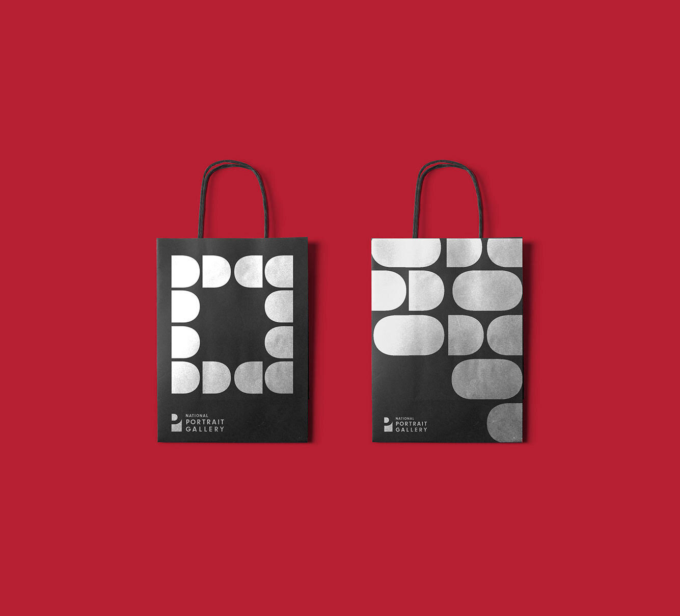
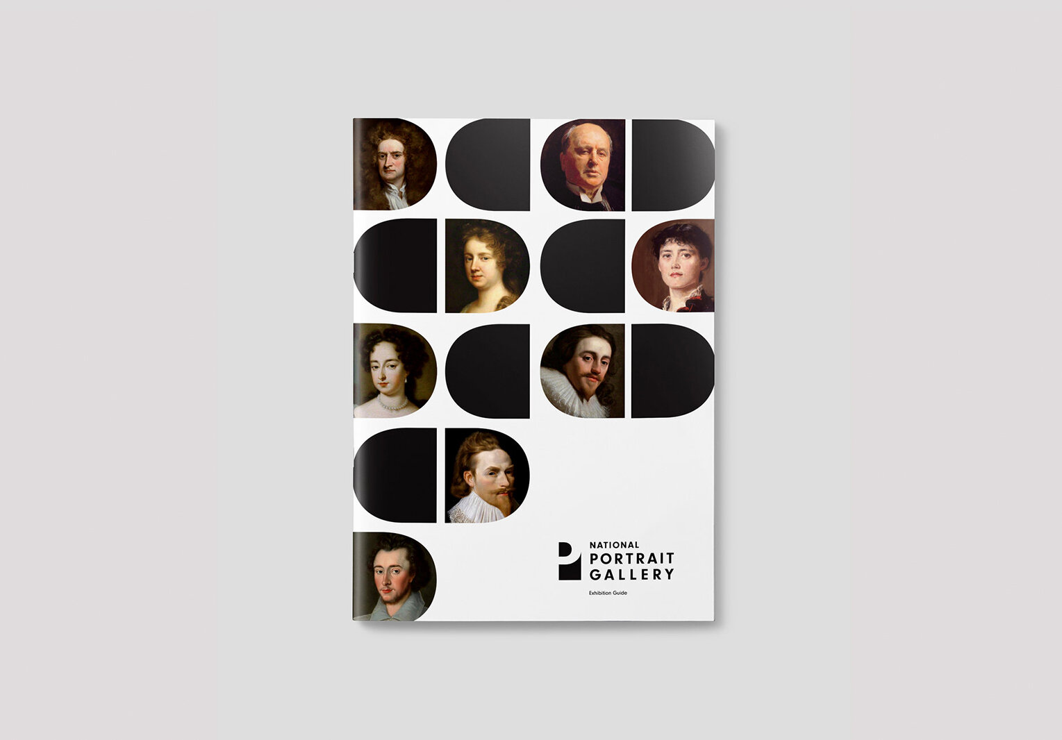
The final rebrand features an icon and a wordmark. A “P”, representing the sitter, is placed on top of the black rectangle to create the icon. This alludes to the creation process of a portrait. The small “D” shape produced through the layering stands for the act of “discovery” within the gallery, which connects to the brand statement. This shape can be used as a frame for various faces as a way to intrigue the public to visit and discover the rest of the portrait. The shapes can also remain black and become a variety of different compositions and patterns. This brand, therefore, can become a flexible system to promote the new additions to local visitors and work as a tool to visually communicate the extensive collection to new potential visitors.

COLOUR PALETTE
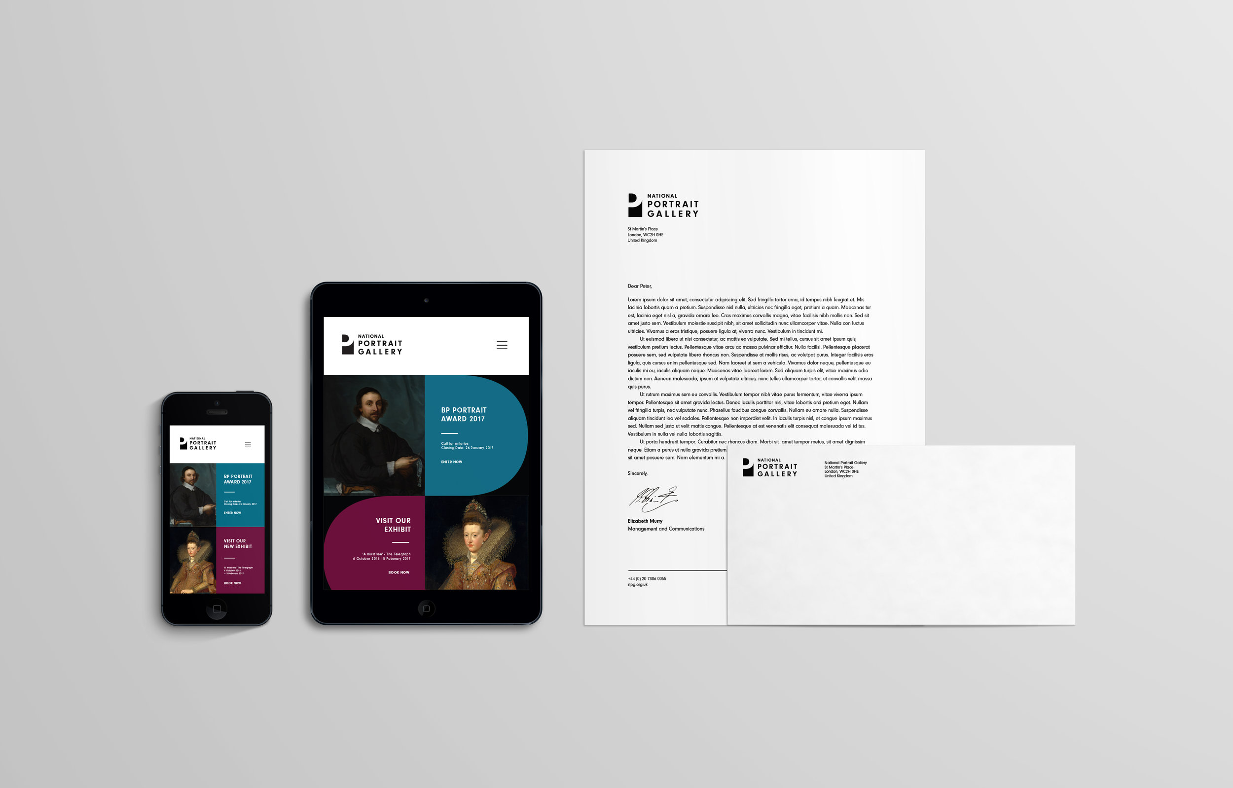
The primary colours of the brand are black and white to avoid it competing with the images. For the collateral applications, this secondary colour palette can be introduced to inject a vibrancy into the page. The warm and cool colours are a direct influence from the interior of the gallery. Using one cool and one warm colour together provides an opportunity to translate the space of the gallery in the public sphere.

BRAND GUIDELINE


MACximal Campaign

La Mer – Moisturizing Soft Cream

M·A·C VIVA GLAM

M·A·C Studio Radiance (coming soon)

JENNY BIRD Anklet Campaign

JENNY BIRD Essentials Campaign

JENNY BIRD Summer Campaign

JENNY BIRD be seen collection

E-Mail Marketing